


How humans learned to paint the world
A journey through nine maps of history that describe how we discovered the world we live in and how we learned to paint it.

One of the illustrators / cartographers I am most passionate about in the 21st century is a Reddit user who goes by the nickname PisseGuri82. In addition to constructing his work with an aesthetic that I find pleasing, most of his maps cover stories that had not been well told before through maps. Or at least not to the same level of detail and with the same elegance. A great example is this gem about Viking expansion.
")
With some research, I found out that the Reddit user is Anders Kvernberg, a Norwegian librarian with incredible knowledge of historical cartography1. Perhaps that is why it should come as no surprise that he created one of the best infographics I know about the history of cartography, the one that best tells how we learned to paint the world.
Here you have the complete piece. Next, I will briefly break it down into its nine fundamental parts.
Ptolemy's world map (150 BC)
It is the first map in history to have a certain scientific basis, as it represents latitude and longitude using astronomical measurements. There is no original copy of this map, but there are many later reproductions made using Ptolemy's original writings and copies, copies, copies…
Before this map by Ptolemy, there were other maps2, but all the ones we know of were much more conceptual than this.
Beatus map from the Saint-Sever Beatus (1050)
This is a classic T-O map. These maps are not of great cartographic value in the mathematical sense, but they do have value to understand the conception of the world in Christianity during the Middle Ages.
T-O maps, as their name suggests, simplify the world as an O with an inserted T. The O represents the great ocean, while the T corresponds to the main bodies of water (the Mediterranean Sea, the Nile River, and the Don River) that divide the world into three parts (Europe, Africa, and Asia).
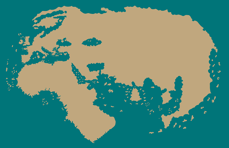
Al-Idrisi’s world map (1154)
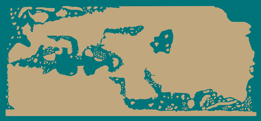
While conceptual maps triumphed in Christian Europe, the cartographers most interested in representing the world descriptively were in Muslim lands.
Al-Idrisi's map, specifically, was created from information provided by different travellers who had voyaged around the world. It clearly aims to be detailed, as can be seen in the more than one hundred islands represented and the exaggerated coastlines. Where it fails, however, is in the distances and actual shapes.
The Catalan Atlas, attributed to Cresques Abraham (1375)
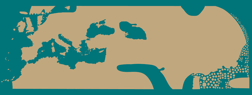
It has always impressed me how unknown this map is for the great masterpiece that it is3.
It is the first accurate map of the Mediterranean Sea and the coasts of North Africa. This is the first map of the list that shows what a good cartographer, with proper detailed information, can achieve. Cresques Abraham was Mallorcan and, as such, had access to information from many sailors who had travelled the confines of the Mediterranean Sea, and that is reflected in his faithful representation. It is clear where the first-hand information ends and the author has to resort to simplified lines or lines copied from other previous maps.
Furthermore, as if all of the above were not enough, this is the first map to include a compass rose. This one.
.jpg)
Map of the world by Henricus Martellus (1489)
The first observation, if we focus solely on the Mediterranean Sea, is that the quality decreases compared to the Catalan Atlas. So why is this map important?
Well, it shows that, shortly before Columbus arrived in America, there was already a general idea of the shape of Europe, Asia, and Africa. We have travellers like Marco Polo to thank for this, but also all the explorers who circumnavigated Africa.
On this map, the latitude is quite accurate, but the longitude data is still very inaccurate.
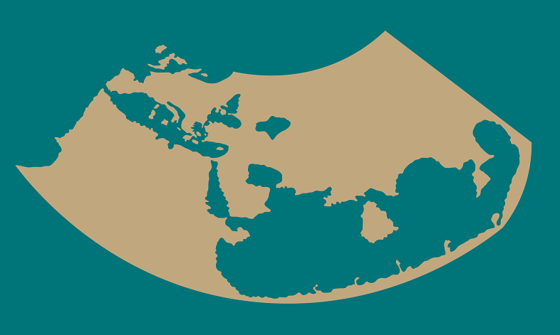
Diego Ribero's world map (1529)
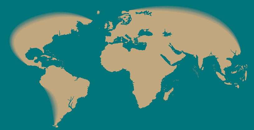
The first obvious thing we can see in this map, compared to the previous maps on the list, is that it shows America. It’s not the first to do so, that honour is usually given to Juan de la Cosa4, who did it 29 years earlier.
Something interesting about this map is that many consider it to be the first scientific map, which I, personally, think would not be fair to the Catalan Atlas. What I find more relevant of this map is that it’s the first to include data from the Magellan–Elcano expedition, which can be appreciated on the coast of South Asia.
Edward Wright's world map (1599)
Welcome, Mercator.
Edward Wright was the first to use Mercator’s projection (after Mercator himself) and he also perfected it. He provided a much more detailed grid and took better account of the Earth's curvature.
It includes some new European discoveries, such as Japan and the Amazon River, but in terms of detail it does not improve on Diego Ribero's map.
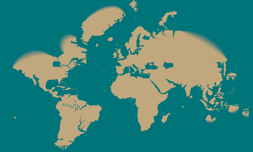
Jacques-Nicolas Bellin’s world map (1778)
The invention of the marine chronometer finally solved the longitude problem, and this was coupled with Europe's great efforts to map the world and obtain more reliable data. The result is a clear improvement in this map.
At this stage, many coastlines are still flagrantly missing. It is safe to say that the mechanisms for producing a perfect map were already in place, all that was needed was detailed exploration and survey of the world.
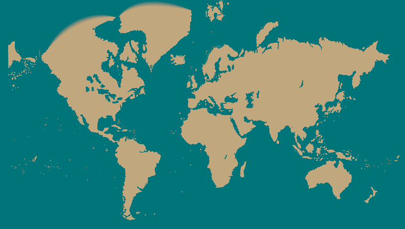
Adolf Stieler’s world map (1832)
In barely half a century, exploration did its part of the work, and we came up with this great cartographic work. The shapes of the coasts seem to have been taken by satellite. Only the polar regions were missing, as the exploration of these regions would come later.
I like the fact that Adolf Stieler's map has made the list and not one of the many similar ones that were produced in the 19th century. Stieler is the author of one of the most influential atlases of 19th-century cartography, which made cartography popular beyond sailors and rulers5.
Anders Kvernberg's selection is very personal. I might have chosen other maps and only agreed on two or three, but together I think it's a brilliant collection. Thanks to the standardisation of colours and aesthetics, it is easier to understand the evolution. Together, these maps tell the story of how we discovered the world we inhabit and how we learned to paint it.
To finish this article, I would like to simplify the process into five steps that humanity had to follow to learn how to create an accurate world map. Five steps that did not happen sequentially:
Definition of latitude and longitude.
Solving the latitude problem.
Adoption of projections.
Solving the longitude problem.
Exploration of the world.
I discovered it when I found an article about it in the Washington Post after I discovered one of the few surviving copies of the Atlas Cedid.
Here I wrote about some of them: The first regional maps and the first world map.
I'll leave you a link so you can see this gem because it deserves it. Another day I'll talk about it in detail.
Here you can have a look at the map of Juan de la Cosa. Another map that, although it has been discussed again and again, I will bring up some day.
I am referring to the Handatlas by Stieler. Yet another thing I need to write about.
Great post!